HGTV MAGAZINE // FRONT DOORS
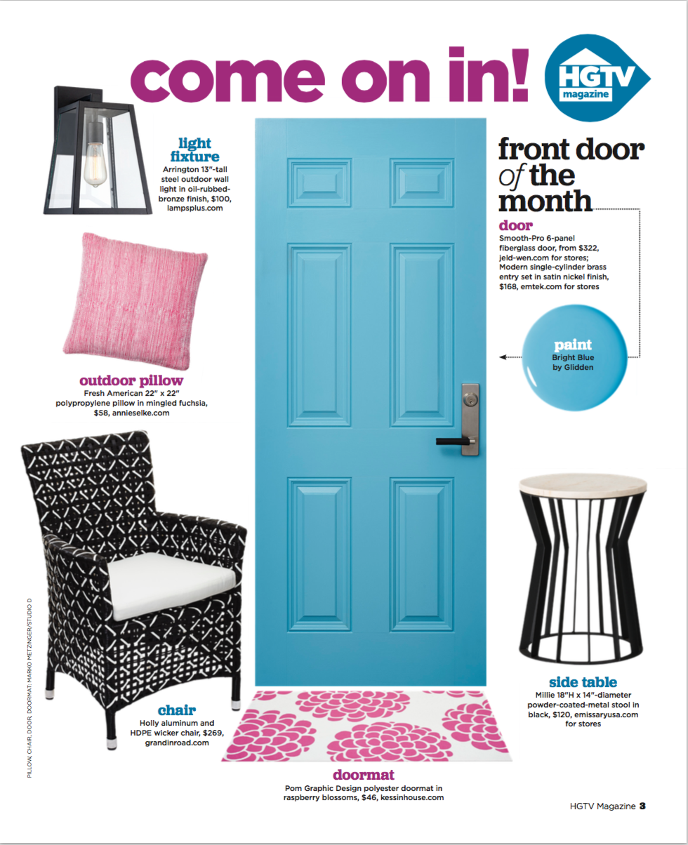
Front Doors of the Month (2015 - 2016)
HGTV MAGAZINE: MAY '16
HGTV MAGAZINE: APRIL '16
HGTV MAGAZINE: MARCH '16
HGTV MAGAZINE: JAN/FEB '16
HGTV MAGAZNE: DEC '15
HGTV MAGAZINE: NOV '15
HGTV MAGAZINE: OCT '15
Work featured in the October 2015 issue.
On-air segments from DIY Network's Blog Cabin 2015 special in Coeur d'Alene, Idaho. The guest bedroom was designed by HGTV Magazine and featured in the October issue.
(courtesy Scripps Networks; original airdate: September 7, 2015)
HGTV MAGAZINE: SEPT '15
HGTV MAGAZINE: JULY/AUG '15
HGTV MAGAZINE: JAN/FEB '15
Work featured in the January/February 2015 issue
(Freelance) Production + Stylist Assistant: Cover
(Freelance) Editorial Assistant: "Smart-Spending Bloggers"
(Freelance) Editorial Assistant: "Living Room Makeover"
(Freelance) Editorial Assistant: "Would You Let This In Your House?"
VERILY MAGAZINE: BAR CART
MAKE YOUR OWN CLASSY BAR CART WITH THIS EASY DIY
BY RACHEL SHIPPY FOR VERILY MAGAZINE
A bar cart, when styled correctly, is the perfect cocktail of cozy and elegant with a shot of old-school authority. Ideally meant for a living room or kitchen, it adds charming storage and ambiance for impromptu entertaining. You've probably seen these bar carts all over Pinterest and Instagram—because, let's be honest, they make for one super chic and classy room.
When I set out to find the right bar cart for my living/dining space, I discovered they are quite pricey and cost even more in square inches. There are terrific brass versions at thrift stores and antique shops, but I needed something more compact for my small apartment.
When I stumbled upon Ikea’s kitchen cart, I knew it would fit the space perfectly, but the available colors wouldn’t mesh with my room’s black-and-white look. The cart also happened to be a bargain, so I decided to get it, knowing a little bit of spray paint and the right styling would achieve exactly what I wanted.
Here’s how:
01. Choose a spray paint color that will elevate the piece and won’t compete with the glassware you’re going to store there. Dark, saturated colors, like navy or red, work best. I went with matte black for a classic look, but you can take it a step further and use a chalkboard finish that will allow you to label each libation.
02. Assemble the Ikea cart using packaged instructions and make sure the connector bolts are securely snug. When it’s completely built, relocate the piece outdoors for proper ventilation, and station it over drop cloths. Now you’re ready to re-coat it with spray paint.
03. Start with a spray paint primer, which will adhere to the metal surface of the cart and help establish an even, blank canvas, fit for every finish. After one coat of primer is dry, apply two to three coats of your spray paint, depending on coverage. The key to successful spray painting is to shake the can well before starting and to hold it 3 or 4 inches away when spraying, always keeping it upright. Move the can back and forth evenly over every inch of the cart, taking breaks to walk away from the fumes and to let each coat dry before you apply another. Multiple, thin coats prevent pooling and drips, so don’t worry about patchiness after your first pass. Spraying little by little works best.
04. When the finished cart is completely dry, bring it back inside and position it exactly where you want it. Once glassware is added to the mix, the cart becomes very clumsy to move, despite the convenience of wheels. I parked mine against a photo wall in the living room to set a clubby mood, but it also works well on a narrow wall or in a niche. Then comes the proper styling.
05. For the most part, you cannot go wrong with an assortment of alcohol in the original glass containers, just make sure to station the tallest bottles in the back. The top tier should be the most visual, since that's where your eye goes first. Take care to remove purchase stickers from each container and feel free to be a bit vain at the liquor store (some brands offer the same beverage in prettier bottles). It all adds to the overall visual of your home bar.
To make my top tier a bit more elegant, I added an intricate glass decanter. It brings the right amount of pomp and circumstance, but it’s also functional for serving special spirits. Clear glass always looks cohesive and won’t compete with the décor of the room, so I recommend sticking to that when styling your cart. Add elevated details like a shaker and stir stick, or traditional bits like your grandmother’s crystal candy jar.
The second tier of the bar cart should neatly display glasses for guests to help themselves to a drink. Mine are mostly martini and highball glasses—the key is how you arrange what you have. Line them up in rows or stacks and make a point of keeping glass clean. A styled bar cart is anything but posh when a layer of dust forms, so wipe it clean and wash the glasses often to secure it as a serving piece.
The bottom tier should station larger bottles and those with varying glass. They anchor the bottom and won’t compete with the clean aesthetic you’ve styled on top.
06. And finally: Invite your friends to catch up over a cocktail or linger over a homey happy hour. Once you’ve created your own bar cart, any room holds the possibility for elegant everyday entertaining.
VERILY MAGAZINE: KITCHEN STYLE
HOW TO GIVE YOUR KITCHEN AN EASY, SPACE-SAVING MAKEOVER
BY RACHEL SHIPPY FOR VERILY MAGAZINE
Like a lot of apartments in New York City, mine has a very narrow galley kitchen with limited cupboards and drawers to store everything. And since easy access to ingredients, equipment, and dishes is important in any kitchen, I set to work creating open storage that would double as chic décor.
01.SPICE STORAGE
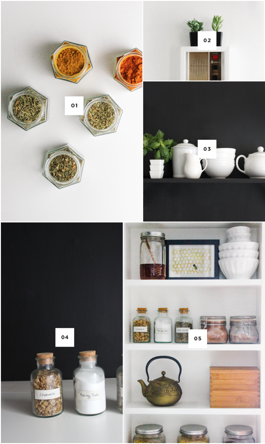
My spice rack is a magnetic space saver that adheres to the side of the refrigerator. This is a great alternative to spices taking up space on the counters or in the pantry. You can certainly make the set yourself by ordering hexagonal glass jars with lids, strong disc magnets, clear circular labels, and of course an array of herbs. After researching the materials, I opted to get an all-inclusive kit online and have been very happy with the results. Not only do I love the colorful honeycomb design on my “wall,” but the jars are also easy to use and put back while I’m cooking. If you don’t want to mount them on the refrigerator, you can purchase and install a magnetic plate to your wall instead.
02. BUZZER
My next step was to dress up my dreary talk box. It's old and can't be painted, but I wanted something nicer to look at when “buzzing” friends into the building. So I measured it and bought a cheap, white box frame that was about two inches bigger on all sides and two inches deep. Using double-sided mounting tape, I adhered the frame to the wall, letting the top rest centered on the talk box. Gravity holds it in place, but the tape ensures a snug fit that won’t budge as you pass back and forth.
Treating the deep frame as a floating shelf, I then rested two mini succulents on top. You can find these petite little pots at garden centers and some grocery stores. I removed my plants from the containers, spray painted the containers, and then re-potted so they would match my black and white decor. Now, the dingy talk box is a cheery little command station.
03. CHALKBOARD WALL
In order to break up the white walls, white cabinets, and white appliances, I needed some accent paint. Using just one quart of black chalkboard paint, I was able to cover the backsplash and opposite facing wall in three easy coats. The matte black finish against the rest of the stark white instantly made the room more interesting, and added some dimension.
After the last coat of chalkboard paint was completely dry, I “seasoned” the wall. Seasoning is when you rub the entire chalkboard surface with the side of the chalk until it is covered, then wipe the surface clean with a damp rag. This process ensures that messages, reminders, and grocery lists always erase easily.
With my remaining chalkboard paint (it's a watery consistency, so a little goes a long way), I was also able to coat a small shelf I then mounted to the same wall. The shelf provides accessible extra storage, and when painted in the same finish as the wall, it disappears visually. I use it to store and display various white serving pieces that look crisp against the black, and even added a little chalkboard container garden to grow go-to herbs.
04. KNIFE RACK
Counter space is another obstacle in any small kitchen, so I try to keep mine as clear as possible. Rather than having to keep a knife block on that precious real estate, I mounted a sleek magnetic strip to the wall for keeping sharp tools up and out of the way. Stationed right above my cutting board, the magnetic storage couldn’t be any easier to reach when I’m slicing and dicing.
05. EXTRA STORAGE
On the narrow wall adjacent to my now chalkboard, I installed a skinny shelving unit, perfect for an open pantry. I found the shelf on an alley-picking adventure, and after washing it, priming it, and coating it twice in high-gloss white enamel, I anchored it to the wall with an “L” bracket. Now it’s the perfect station for coffee, tea, and random dry storage items like pasta and granola. The enamel finish makes the shelf easy to wipe clean, and sticking to a theme of clear containers keeps the whole area looking cohesive rather than cluttered. For even better results, anchor the shelf on a wall that gets plenty of natural light so the display really sings.
When it comes to narrow kitchens, it’s all about maximizing storage and counter space. For those items that can’t be concealed, just try to keep in mind the visual impact of uniform containers that are neatly displayed.
VERILY MAGAZINE: PAINTED WALLPAPER
GIVE YOUR ENTRY HALL A STYLISH KATE SPADE-INSPIRED DIY MAKEOVER
BY RACHEL SHIPPY FOR VERILY MAGAZINE
Renting a small apartment in New York City comes with its challenges. Chief among them: design. Natural light and spacious rooms are hard to come by, and most renters are required to patch and paint their walls back to white before moving out.
Keeping all of this in mind, I decided to spruce up my narrow entry hall with a bold look that can easily be restored to a blank canvas. The finished product is this painted polka-dot wallpaper, which transforms an otherwise overlooked space into a fresh and preppy room of its own.
In addition to the walls, my beat-up front door had great potential. By emphasizing its awesome hardware and re-coating it in a punchy hue, my re-vamped door now makes an ideal focal point for the entire entryway.
Here are the steps to follow to re-create this design:
01. Open windows to ventilate your workspace, and remove any furniture, frames, or rugs that could get damaged. Cover the floor with drop cloths, and if you are painting close to the ceiling, tape a trash bag across that area. Use painter’s tape to protect any other structural elements from mist and splatters (in my case, this was the crystal door knob on the closet adjacent to my front door).
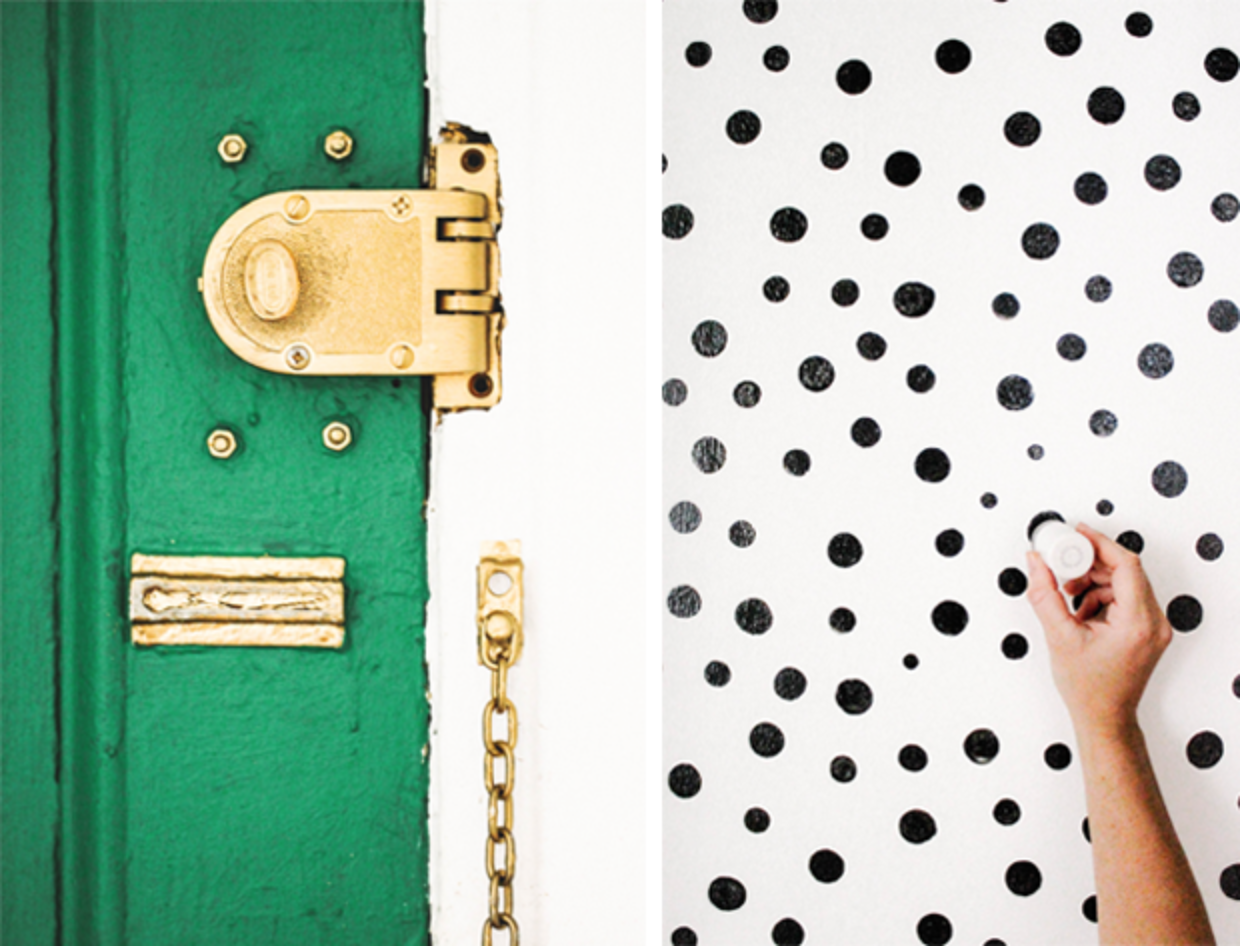
02. Elevate and emphasize the room’s existing accents by spray-painting them a shiny gold. I coated my fuse box, upper molding, door hinges, dead bolt, doorknob, and peephole using Rustoleum Metallic Gold Spray Paint. Some of these items were already gold-plated or brass, but the spray paint ensures everything is uniform and polished. The key to successful spray paint application is holding the can at a safe distance (4-6 inches from the surface) and covering each area in a light, even coat to avoid pooling and drips. The drying time also gives you an opportunity to step away from the fumes while they dissipate. Apply up to three coats depending on coverage.
03. Once the gold is dry, begin painting the walls a clean white, using painter’s tape to edge around areas such as the upper molding and fuse box. Continue to trim in white around the gold-coated areas and on the walls, ignoring the door. When finished, you should have a gold-embellished canvas of white, primed for polka dots.
04. Make sure the white walls are completely dry before starting this step. You’ll need less than a quart of paint to create the black polka dots (or colorful dots of your choosing). I recommend starting with a paint sample from the hardware store and buying a second, only if needed. Pour a small amount of paint onto a paper plate and dip a circular foam stamp into the paint, without over-saturating. I used Martha Stewart Foam Pouncers. To ensure each dot comes out perfectly, apply the stamp to the wall in a twisting motion (otherwise you could end up with dripping or patchy coverage). You can measure in between each polka dot but it’s easy enough to eyeball, which is the method I used. Cover the walls in evenly spaced spots, using varying sized circles as you wish. Clean up any less-than-perfect polka dots using a small brush and white paint. Allow to dry completely.
05. Now for a pop of color: I recommend a satin or semi-gloss paint for an interior front door, since both finishes can easily be wiped clean. I picked a bright green from Behr called “Chlorophyll” and saturated the door in two coats. After first applying painter’s tape to protect the gold-sprayed door hinges, peephole, dead bolt, and doorknob, I was able to trim the difficult areas with a small, chiseled paintbrush.
06. Remove any remaining painter’s tape and allow for the door to dry completely. Re-position frames, furniture, and rugs, and enjoy your newly fabulous foyer!
GOOD HOUSEKEEPING(.com): KITCHENS
14 Ideas to Steal From These Seriously Covetable Kitchens
Click to view original post for GOODHOUSEKEEPING.COM
GOOD HOUSEKEEPING(.com): REFRIGERATORS
9 Ways to Dress Up Your Fridge Door
Click to view original post for GOODHOUSEKEEPING.COM
GOOD HOUSEKEEPING(.com): LAUNDRY ROOMS
A Stylish, Organized Laundry Room Is Possible
BY RACHEL SHIPPY
Click to view original post for GOODHOUSEKEEPING.COM


